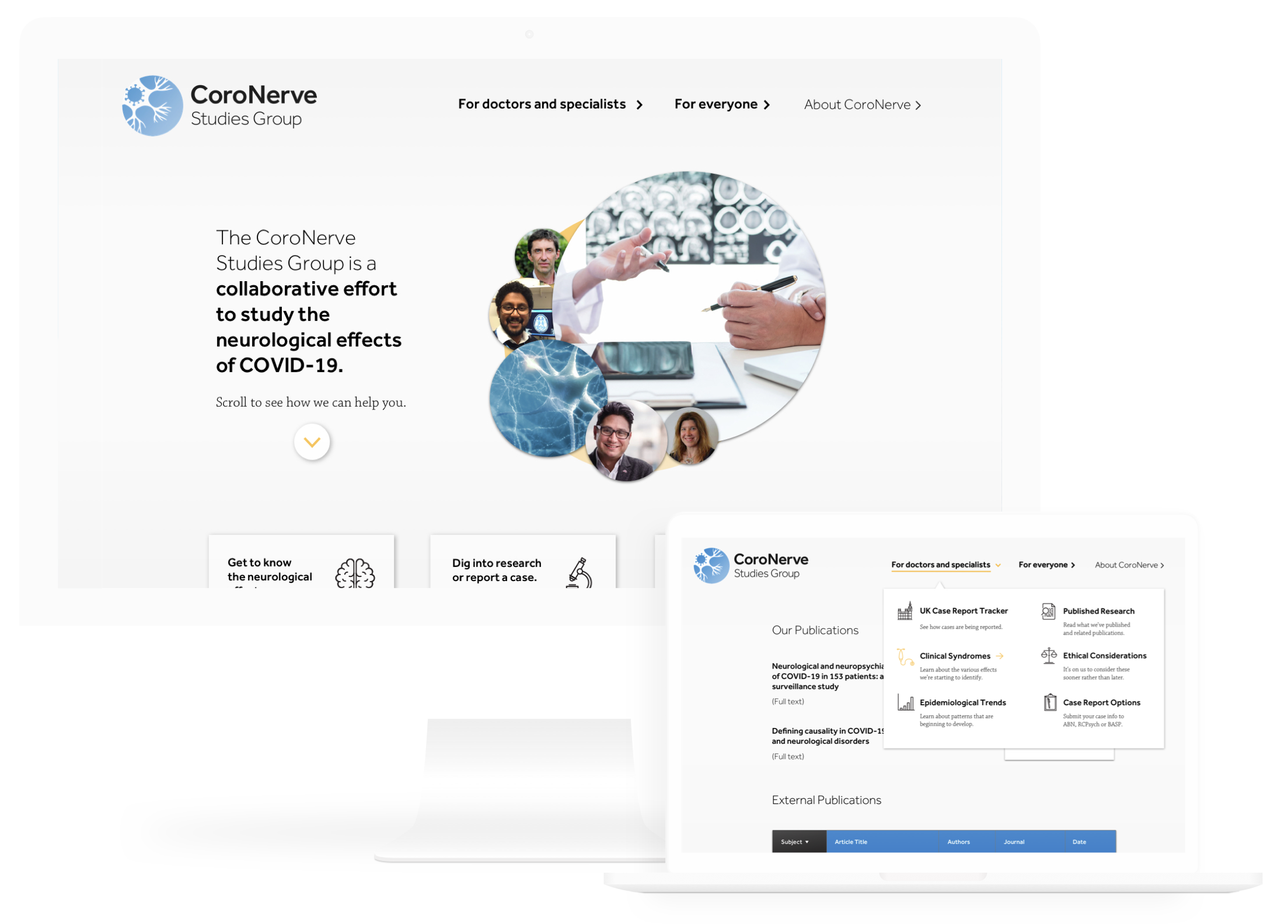
Website Update, Identity
and Design System
Project Role
UI, Visual Design, Project Management
Teammates
Jim Senti, Cooper Daniel
What is CoroNerve?
CoroNerve is a collaborative research initiative in the United Kingdom that aims to understand the potential neurological effects of COVID-19 infections.

It's run by a team of volunteers, but they're working closely with the ABN, BASP and RCPsych in the United Kingdom.
What's the context?
The work you're about to see was produced in conjunction with CoroNerve itself and is in the process of being built! 

We worked closely with Dr. Aravinthan Varatharaj, Beth Tenorio and Mustafa Sultan from their team.
Existing Website
and Findings
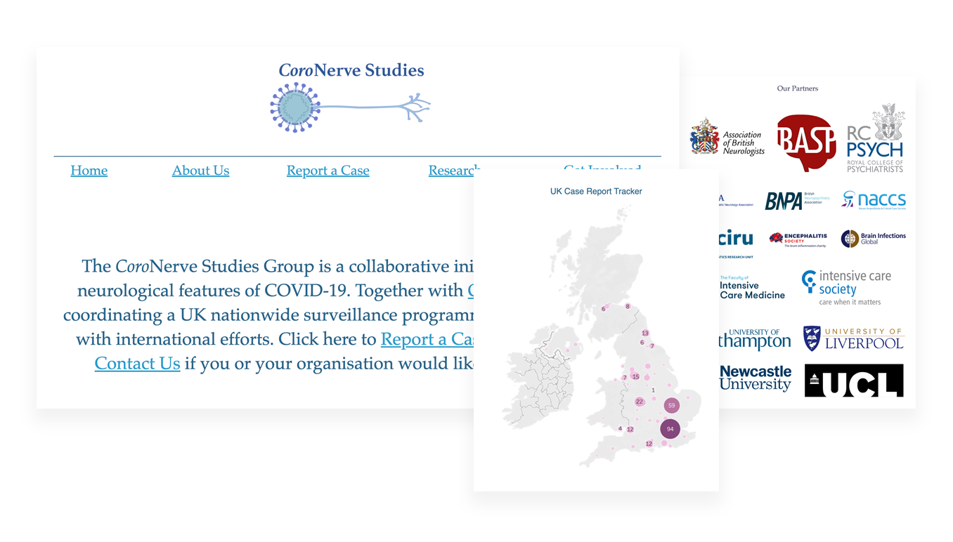
CoroNerve's developer put the current version of their website together on the fly and completely solo. It includes all of the information necessary to catch up with relevant research, a static case report tracker graphic, and a form for submitting new cases.

Our heuristic evaluation returned the same conclusion their team had: their current solution felt pretty barebones and left plenty of room for confusion.
Research Phase
Our team conducted user interviews and contextual inquiries over Zoom with both public users and with doctors. We wanted to get a good understanding of the motivations and experiences of both audiences when it comes to gathering information about COVID-19.
"I want to know the information
I find is reliable."

"Why should I care if the information I do find tends to change?"

"I want to feel confident I understand the neurological effects of COVID-19."
Doctor Problem Statement
The medical community needs an up-to-date reference on the neurological effects of COVID-19 so that they can diagnose accurately, relay insight to patients, report cases, and keep up with relevant research.
Public Problem Statement
People need to be able to access and share credible information on the neurogical effects of COVID-19 so that they can understanding symptoms and keep up with developing research.
HMW Question
How might we improve user experience on the CoroNerve website so that it serves as a trustworthy informational
hub on the neurological effects
of COVID-19 for the
medical community and
the public at large?
Design Studio Sketches
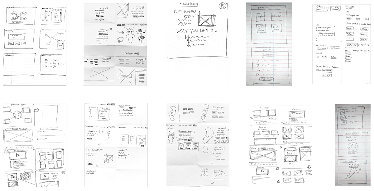
With our two problem statements consolidated into one actionable HMW statement, we jumped straight into sketching out rough ideas.

We were lucky enough to have our client present over Zoom and got to pull them into some ideation! This surfaced some really interesting data visualization ideas.
Medium Fidelity Prototype
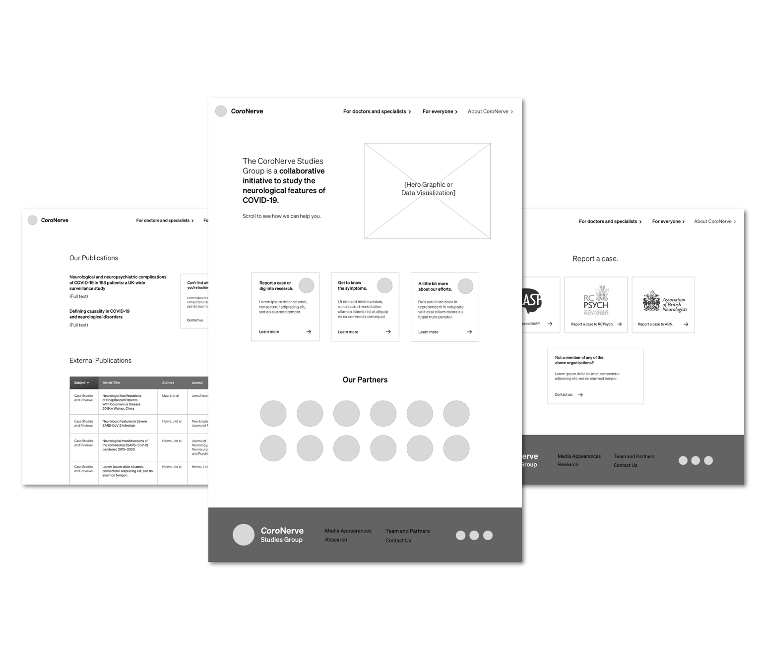
Compiling some of the ideas from some rough sketches, client feedback and our affinity map insights, I constructed an interactive prototype without design touches to test how our new information architecture, layout and label changes would play out for prospective users.

Usability testing results were largely positive, but did reveal that our writing was misleading to both audiences at certain points.
Branding and
Design System
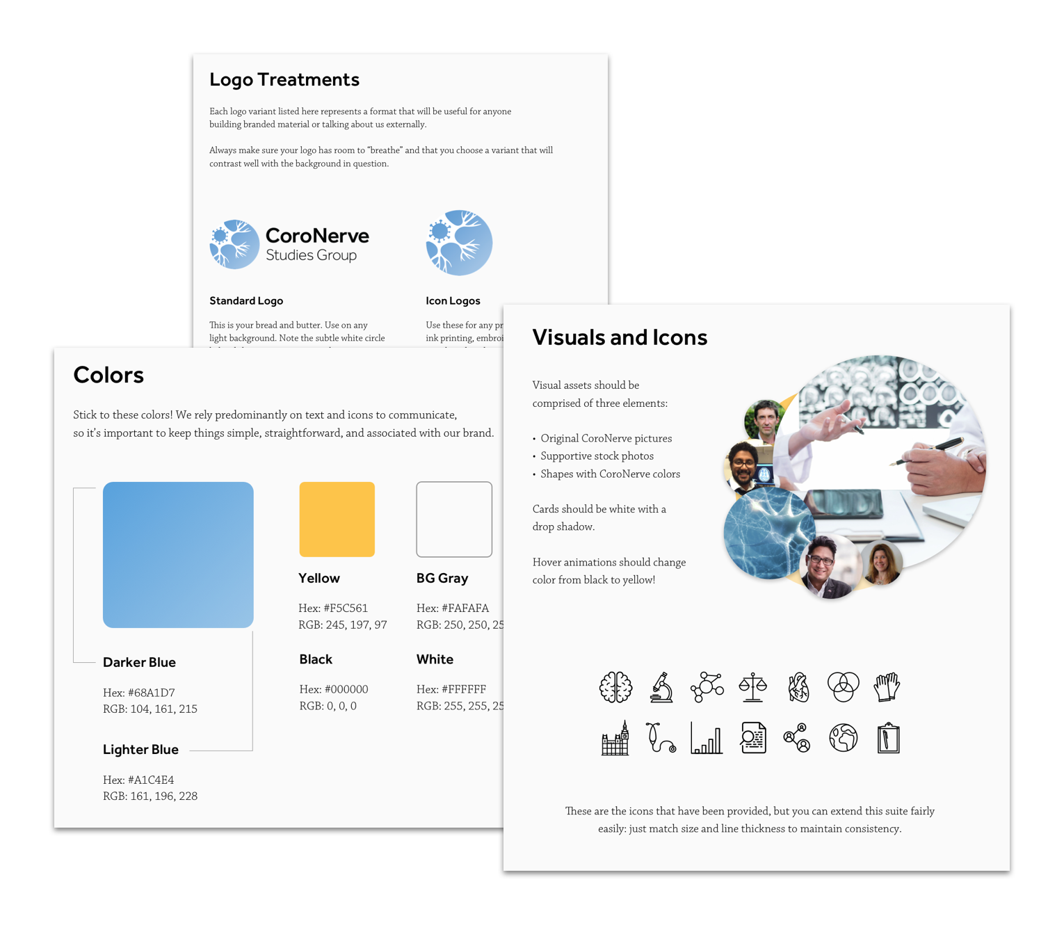
Building a visual identity isn't strictly part of the UX process, but our goal was to deliver as much impact to our client as possible. Since I'd had previous experience, I put together
a new identity and a fresh logo that would align with our goals to make the CoroNerve website more accessible.

This included some guiding design principles, logos and treatment guidance, a color scheme and some visual assets and iconography to bolster the new layout.
Deliverables and Next Steps
With usability test results and a design system, I constructed a prototype that would give usability testers a chance to feel like they were playing with a full site.

We delivered this to the client on InVision and through Zeplin, so their developer could hit the ground running with these new ideas. They're in the process of refereshing their site now!
See interactive prototype