
Mobile App Update
Project Role
Team Lead and UI Design
Teammates
Hiba Jaafari, Zach Grumet, Jongmi Bae
What is iNaturalist?
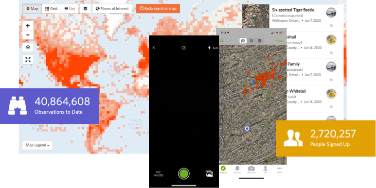
iNaturalist is a joint initiative of the California Academy of Sciences and the National Geographic Society.
It gives anyone the chance to make an observation, identify it, and contribute it to biodiversity studies. iNaturalist has more than 2.7 million registered users, 40 million observations, and 24 million ID confirmations since its inception in 2008.
It gives anyone the chance to make an observation, identify it, and contribute it to biodiversity studies. iNaturalist has more than 2.7 million registered users, 40 million observations, and 24 million ID confirmations since its inception in 2008.
What's the context?
The work you're about to see addresses
real-world problems iNaturalist users might encounter, but this is a concept project for now.
real-world problems iNaturalist users might encounter, but this is a concept project for now.
Existing Website and Findings
You can interact with iNaturalist by creating an account and uploading observations, but we’ll be spending some time with the mobile app for this case study. This app doesn’t just let you record observations—its AI powered camera will give you an educated guess about what you just captured.
We concluded that veteran users wouldn’t have much difficulty accomplishing their tasks, but that even with an onboarding process, new users could be disoriented
We concluded that veteran users wouldn’t have much difficulty accomplishing their tasks, but that even with an onboarding process, new users could be disoriented
Research Phase
In addition to a heuristic evaluation and an analysis of iNaturalist's competition, each member of our team reached out to potential new users and interviewed them about social media usage, learning apps and their relationship with nature.
"I value time spent in nature because I can satisfy my curiosity."
"I enjoy using social media because it means I can connect with a community."
"I like to learn by searching but want it to be quickly accessible."
"I enjoy using social media because it means I can connect with a community."
"I like to learn by searching but want it to be quickly accessible."
Problem Statement
Nature goers need an easy way to browse and identify wildlife and share findings with a community because current methods leave curiosity unsatisfied.
HMW Question
How might we help iNaturalist users navigate the app so that there's no barriers to quickly browse and identify observations?
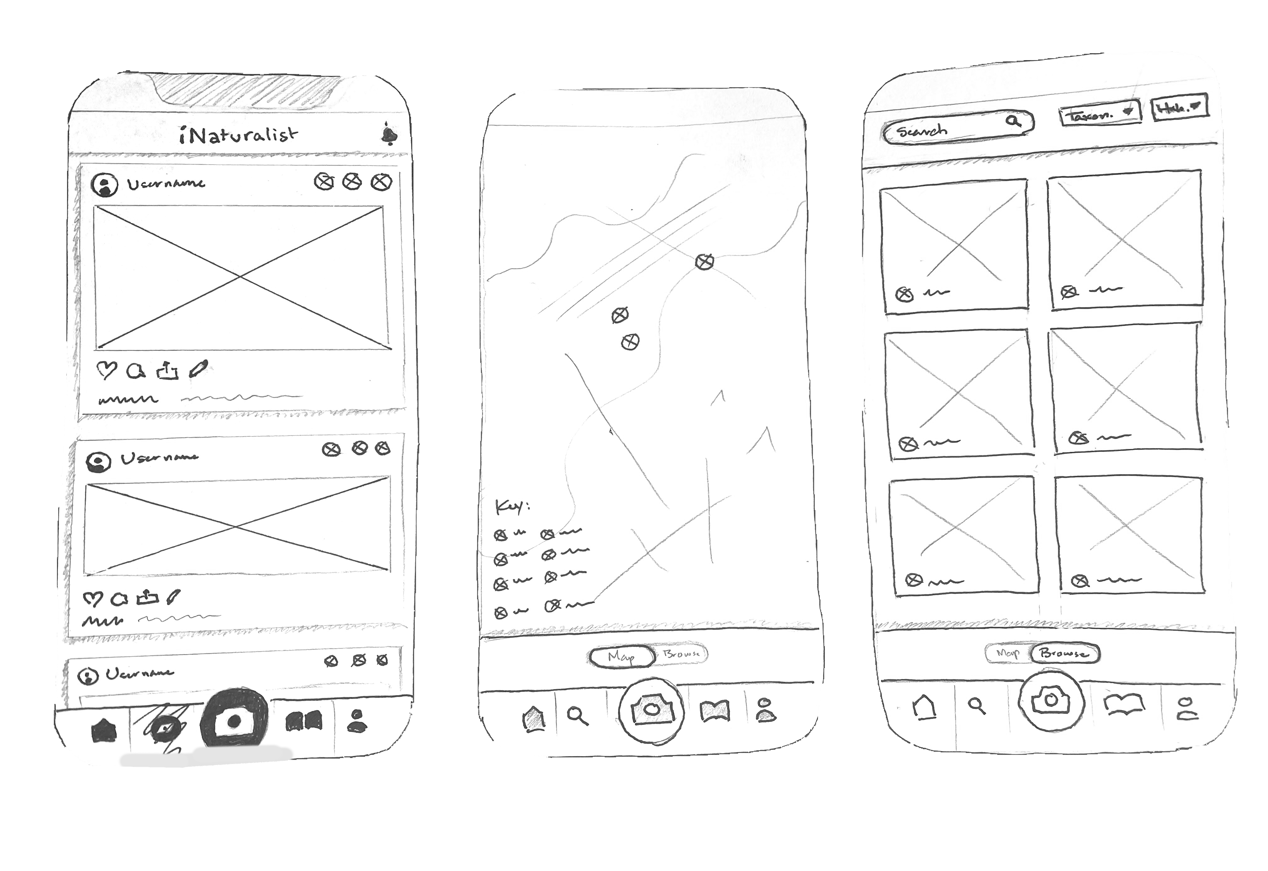
Design Studio Sketches
With our newly defined problem, we jumped straight into sketching out rough ideas. After each round, we compared and incorporated each other's ideas.
We were generating some interesting solutions to our navigation issue, but we were whiffing on another highlighted by our heuristic evaluation: consistent iconography.
We were generating some interesting solutions to our navigation issue, but we were whiffing on another highlighted by our heuristic evaluation: consistent iconography.
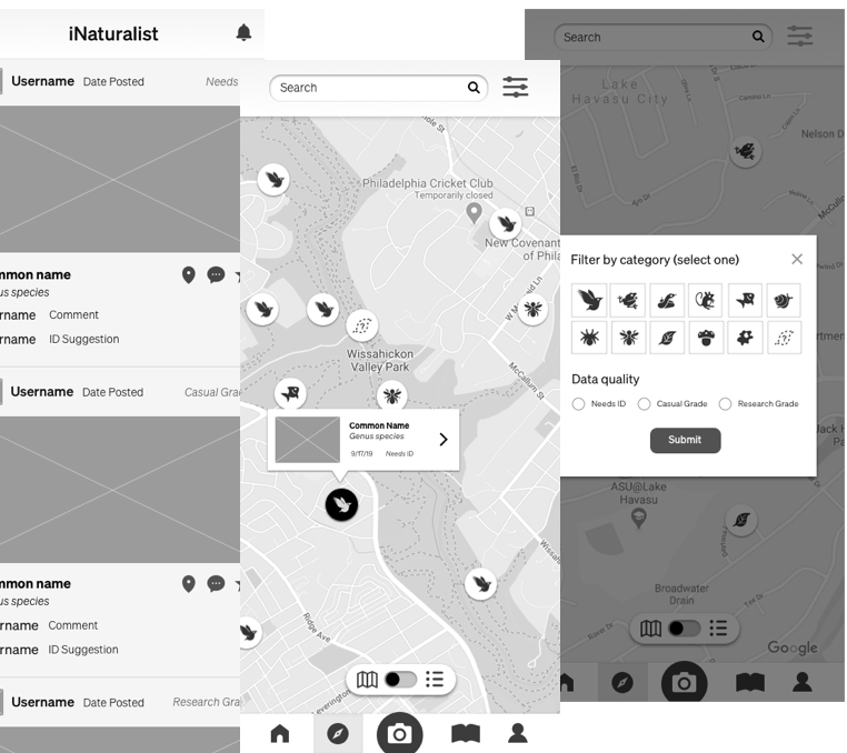
Medium Fidelity
Prototype 1.0
Prototype 1.0
Here's a few of the key features we tried incorporating into our first interactive prototype:
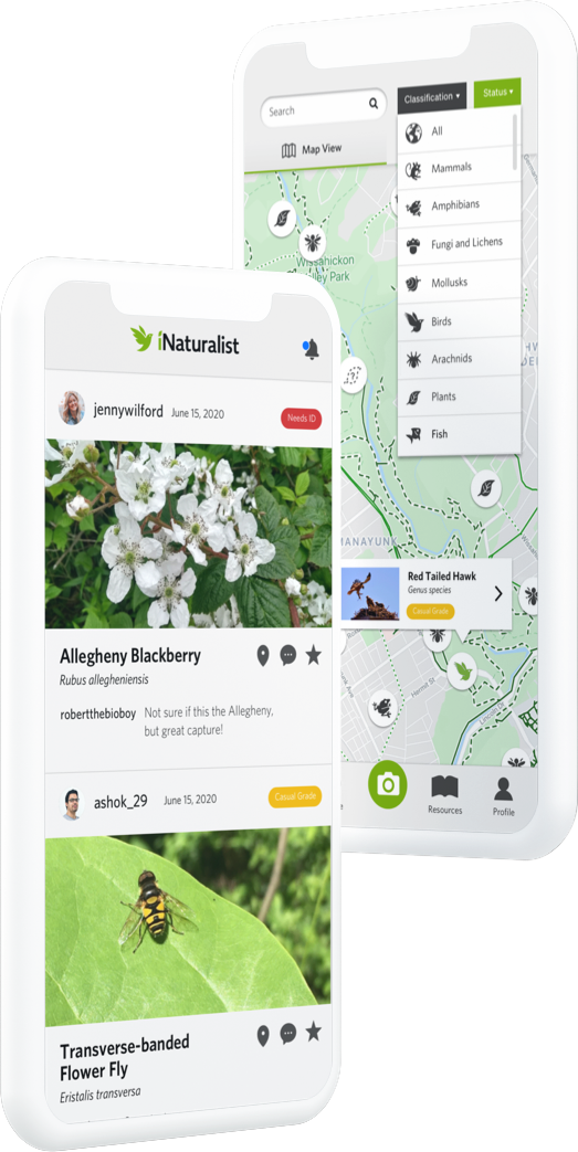
• Employ icons instead of colored pins
• Make map/list view toggle more visible
• Allow users to filter results
• Employ icons instead of colored pins
• Make map/list view toggle more visible
• Allow users to filter results
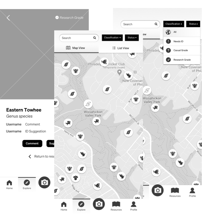
Medium Fidelity
Prototype 2.0
Prototype 2.0
Here's a few of the key features we tried incorporating into our first interactive prototype after some usability testing:
• Reintroduce onboarding screens
• Account for side tasks and failures
• Split filter options and increase visibility
• Align with dashboard
See interactive prototype
• Reintroduce onboarding screens
• Account for side tasks and failures
• Split filter options and increase visibility
• Align with dashboard
Conclusion and Next Steps
Coming in August: a fully interactive high fidelity prototype, informed by our usability testing results.
Here are a few focus points:
• Increased data quality status visibility
• Build camera ID flow
• Build “Suggest ID” flow
• Further align prototypes with website
Here are a few focus points:
• Increased data quality status visibility
• Build camera ID flow
• Build “Suggest ID” flow
• Further align prototypes with website